VISUALIZATION
NASA's Scientific Visualization Studio Wins First Place in Video Contest

The data visualization studio at NASA's Goddard Space Flight Center in Greenbelt, Md., was awarded first place for its video entry in a visualization challenge sponsored by the journal Science and the National Science Foundation.
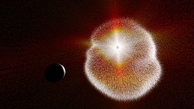
The winning entry was created by the Scientific Visualization Studio to show how the particles from solar storms bombard Earth and how the sun's heat energy drives Earth's climate and weather. It won first place in the video category in the 2013 International Science and Engineering Visualization Challenge.
The visualization was created for a movie called "Dynamic Earth," a full-length planetarium film produced by Thomas Lucas and narrated by actor Liam Neeson. The film is showing around the world to an estimated viewership of 500,000 people.
{media load=media,id=93,width=200,align=left,display=inline}
While the full movie highlights many aspects of Earth's complexity, the contribution from the SVS depicts the vast scale of the sun's influence on Earth, from the flowing particles of the solar wind and the fury of coronal mass ejections to the winds and currents driven by the solar heating of the atmosphere and ocean.
"Moving through these flows gives the viewer a sense of grandeur in the order and chaos exhibited by these dynamic systems," said Horace Mitchell, director of the Scientific Visualization Studio.
The visualization represents a high point in the SVS's work in recent years to visualize flows - ocean currents, winds, the movement of glaciers and ice sheets. By using lines and arrows to represent velocities of water, air and ice - and in the case of "Dynamic Earth," the solar wind - the SVS visualizers were able to produce a new way to envision these unseen forces.
"Usually we visualize things like temperature in the ocean or clouds in the sky. You see these things change, but that's not really visualizing the flow. That's visualizing something reacting to the flow," Mitchell said. "You can't really see currents in the ocean. But in your mind's eye you can picture how the currents would move as arrows or lines. And that's what we developed."
The winning visualization was created by SVS visualizers Greg Shirah, Tom Bridgman and Horace Mitchell, with assistance from Lori Perkins, Cindy Starr, Ernest Wright, Trent Schindler and Stuart Snodgrass. The elements of the four-minute segment were chosen in collaboration with Dynamic Earth writer and producer Thomas Lucas.
In showing the solar wind, atmospheric winds and ocean currents, the SVS relied on three modeling efforts that NASA leads or takes part in.
For the solar wind, the visualizers used data from the Community Coordinated Modeling Center at Goddard, a multi-agency partnership focused on improving our understanding of space weather.
To show Earth's winds, the visualizers relied on data from the Modern Era Retrospective Reanalysis, an effort based at Goddard to combine more than 30 years of satellite observations and modeling into a unified data set. And for ocean currents, the visualizers used data from the ECCO-2 modeling effort, a partnership between NASA's Jet Propulsion Laboratory in Pasadena, Calif., and Massachusetts Institute of Technology, Boston.
Mitchell credits the advancement of models such as these for allowing the data visualizers to push the boundaries of what they can create.
"They are so professional now," Mitchell said, "that you can get these amazing effects out of them."
